Property Performance Comparison Dashboard
Rank all properties by occupancy, NOI, collections, renewals, and satisfaction. See heat maps showing red-yellow-green status across every metric. Identify bottom quartile underperformers instantly and deploy resources strategically. Most portfolios recover 300-800 bps of NOI ($3M-8M on $100M portfolio) by fixing concentrated underperformance.

Getting Started
1️⃣ Connect Your Property Management System Link your PM system to pull data from all properties—occupancy, rent, collections, lease terms, unit counts. This establishes your performance baseline.
2️⃣ Import Financial Data Connect your accounting system to bring in NOI, operating expenses, and revenue data by property. Calculate margins and benchmark against portfolio averages.
3️⃣ Define Your Metrics & Targets Set portfolio-wide targets for occupancy (95%?), collections (98%?), renewals (70%?), NOI margin (45%?). Properties are ranked against these targets.
4️⃣ Add Operational Data Import maintenance costs, turn times, satisfaction scores, manager information. This enriches the comparison with operational context.
5️⃣ Start Managing by Data Day one: See which properties are top/bottom quartile. Week one: Investigate why bottom performers are struggling. Month one: Implement targeted interventions. Quarter one: Track improvement.
Stop Guessing Which Properties Need Help: Portfolio-Wide Performance Intelligence
See all properties ranked on occupancy, NOI, collections, renewals, and satisfaction. Know instantly which properties are killing it and which need intervention.
Heat maps and visual benchmarks reveal performance clusters. Why do your top 3 properties average 96% occupancy while bottom 3 average 87%? See the patterns.
Stop spreading yourself thin. Identify your bottom quartile properties—they’re bleeding 80% of the value. Focus there first, protect NOI fast.
The Portfolio Management Problem Destroying NOI
If you’re managing multiple properties, these blindspots are costing you millions in underperformance:
⚠️ Equal attention fallacy: Spending equal time on all properties when 20% of properties drive 80% of underperformance
⚠️ Performance blindness: No single view showing which properties excel and which struggle—decisions based on “feel”
⚠️ Delayed intervention: Discovering Property C has 84% occupancy in month 3, not month 1—three months of lost revenue
⚠️ Manager accountability gap: No clear link between manager tenure/skill and property performance—can’t reward top performers or coach struggling ones
⚠️ Metric inconsistency: Property A reports occupancy one way, Property B another—can’t compare apples to apples
⚠️ Operational best practice mystery: Top properties run at 45% NOI margin, bottom at 32%—but you don’t know what they do differently
⚠️ Resource misallocation: Sending corporate resources to well-performing properties out of habit, not data
⚠️ No early warning system: Properties decline gradually—occupancy drops from 94% to 91% to 87%—but no alerts trigger intervention
Portfolio with inconsistent property performance = 300-800 bps NOI underperformance = \(3M-8M annual loss on a \)100M portfolio. Time to see clearly.
Your New Reality: Complete Portfolio Performance Visibility
Property Performance Rankings
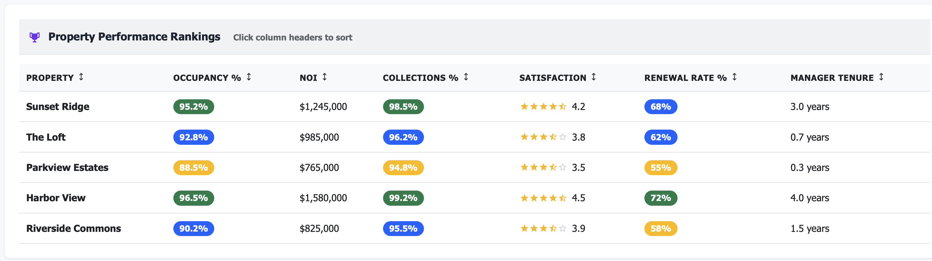
Know who’s winning, who’s losing:
Harbor View: 96.5% occ, $2,150 rent, 72% renewals (Top Quartile)
Sunset Ridge: 94.2% occ, $1,975 rent, 68% renewals (2nd Quartile)
Riverside Commons: 91.8% occ, $1,850 rent, 61% renewals (3rd Quartile)
Parkview Estates: 87.3% occ, $1,775 rent, 54% renewals (Bottom Quartile - ALERT)
Instant clarity on portfolio health
Performance Heat Map
See patterns at a glance:
Green: Exceeds targets (Harbor View: all green)
Yellow: Meets targets (Sunset Ridge: mostly green/yellow)
Red: Below targets (Parkview Estates: 4 red metrics - needs help NOW)
Visual intelligence beats spreadsheet chaos
Quartile Distribution
Understand portfolio balance:
Top Quartile: 2 properties (40% of NOI)
2nd Quartile: 3 properties (35% of NOI)
3rd Quartile: 2 properties (18% of NOI)
Bottom Quartile: 1 property (7% of NOI - fix this!)
Concentrated underperformance = concentrated opportunity
Real Results: From Portfolio Chaos to Performance Excellence
Metric |
Before Performance Comparison |
After 12 Months |
|---|---|---|
Portfolio occupancy |
91.2% (uneven) |
94.8% (consistent) |
Bottom quartile occupancy |
85.7% (unnoticed decline) |
92.5% (targeted improvement) |
Portfolio NOI margin |
38.5% (wide variance) |
43.2% (optimized) |
Manager turnover |
35% annually (no accountability) |
12% annually (clear metrics) |
Time to identify issues |
45-60 days (reactive) |
Real-time (proactive) |
Resource allocation efficiency |
40% (equal distribution) |
85% (data-driven focus) |
Properties needing intervention |
Unknown (gut feel) |
2 flagged immediately |
Annual value recovered |
— |
$2.4M across 8-property portfolio |
Features That Transform Portfolio Management
📊 Multi-Metric Property Rankings
Sort and rank all properties by any metric:
Occupancy % (who’s full, who’s struggling?)
NOI and NOI margin (who’s profitable?)
Collections rate (who’s collecting rent?)
Renewal rate (who’s retaining residents?)
Resident satisfaction (who’s delivering service?)
Maintenance cost per unit (who’s operationally efficient?)
Manager tenure (experience correlation?)
Click any column header, instant re-sort.
🎯 Performance Quartile Classification
Automatically group properties into performance quartiles:
Top 25%: Best performers—study them, replicate their practices
2nd Quartile: Above average—maintain momentum
3rd Quartile: Below average—identify improvement opportunities
Bottom 25%: Underperformers—immediate intervention required
Focus your time on the bottom quartile where 80% of value leakage occurs.
🔥 Red/Yellow/Green Heat Map
Visual performance grid showing every property across every metric:
Green: Exceeds target (celebrate this)
Yellow: Meets target (monitor this)
Red: Below target (fix this now)
Scan in 10 seconds what would take 30 minutes in spreadsheets.
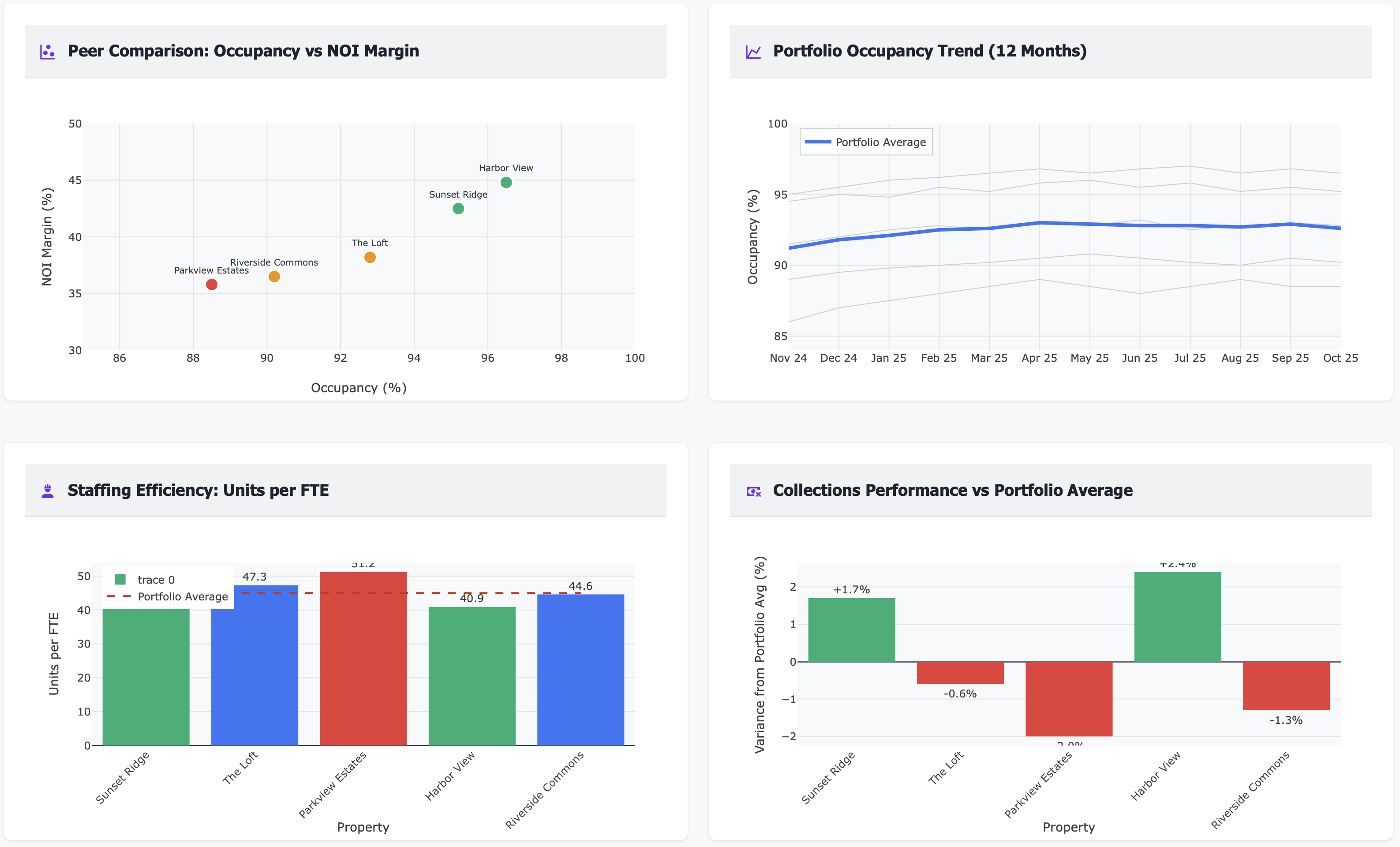
📈 Year-Over-Year Performance Comparison
Track every property’s trajectory:
Occupancy: This year vs last year
NOI: This quarter vs same quarter last year
Renewals: Rolling 12-month vs prior 12-month
Collections: Current vs historical baseline
See who’s improving, who’s declining.
💰 NOI Waterfall Analysis
For each property, break down NOI performance:
Revenue vs budget (above or below?)
Operating expense variance by category
NOI contribution to portfolio total
NOI margin vs portfolio average
Understand the drivers of over/underperformance.
👥 Manager Performance Correlation
See the link between manager characteristics and property outcomes:
Manager tenure vs occupancy (longer = better?)
Manager tenure vs renewal rate
Manager tenure vs resident satisfaction
Properties by manager (one manager = 3 properties, how do they compare?)
Data-driven manager evaluation and coaching.
📉 Underperformance Alert System
Auto-flag properties falling below thresholds:
Occupancy drops below 90% (alert!)
Renewal rate drops below 60% (alert!)
Collections below 96% (alert!)
NOI margin 500+ bps below portfolio average (alert!)
Early intervention saves revenue.
🔄 Property-to-Property Benchmarking
Compare any property to portfolio average or to peer properties:
“How does Parkview compare to portfolio average?”
“How does Parkview compare to similar Class B properties?”
“Why does Harbor View have 96% occupancy when Parkview has 87%?”
Learn from top performers, apply lessons to bottom performers.
📊 Composite Performance Score
Single score (0-100) combining weighted metrics:
Occupancy (25% weight)
NOI margin (25% weight)
Collections (20% weight)
Renewals (20% weight)
Satisfaction (10% weight)
One number summarizing property health—rank properties instantly.
🎯 Resource Allocation Dashboard
See where you’re spending time and money:
Capital expenditure by property (are you investing in the right places?)
Corporate visits and support hours by property
Training and development by property team
Align resources with problems, not with politics.
📅 Performance Trend Analysis
6-12 month trends for every property:
Is occupancy trending up or down?
Is NOI margin improving or eroding?
Are renewals accelerating or decelerating?
Catch problems early, celebrate wins.
🏆 Best Practice Identification
For top performers, document what they do differently:
Operational procedures
Staffing models
Marketing tactics
Resident engagement programs
Vendor relationships
Codify and replicate what works.
Perfect For
Regional/Portfolio Managers
See all properties at once, identify underperformers instantly, allocate time to highest-impact opportunities, and track manager performance objectively
VPs of Operations
Understand portfolio-wide performance patterns, deploy resources strategically, benchmark properties against each other, and drive operational excellence
Asset Managers
Monitor property performance vs budget, identify NOI leakage, build investment cases for capital allocation, and track ROI on operational improvements
Use Case: Identifying and Fixing Bottom Quartile Underperformance ($2.4M Recovered)
Real Customer Story
Challenge: An 8-property, 1,850-unit portfolio had widely varying performance but no systematic way to compare properties. Regional manager divided time equally across all properties, not knowing that 2 properties were severely underperforming. Portfolio NOI margin: 38.5%, but no visibility into which properties dragged it down.
Dashboard Revealed:
Portfolio occupancy: 91.2% (but ranged from 85.7% to 96.5%)
Parkview Estates: 85.7% occupancy (bottom quartile, 8 points below average)
Riverside Commons: 88.9% occupancy (3rd quartile, needs attention)
Harbor View: 96.5% occupancy (top quartile, best practices source)
NOI margin variance: 32% (Parkview) to 47% (Harbor View)—15 point spread!
Manager tenure correlation: Properties with 2+ year managers averaged 94.1% occupancy vs 88.3% for <1 year
Collections: Parkview at 93.2% (red flag), portfolio average 97.5%
Renewal rates: Parkview 54%, Riverside 61%, Harbor 72%—huge variance
Maintenance costs: Parkview spending \(425/unit/year vs portfolio avg \)285/unit/year
Heat map: Parkview showed 5 red metrics, 2 yellow, 0 green
Action Taken:
Bottom quartile deep-dive: Spent 60% of regional manager’s time on Parkview and Riverside (vs 25% before—equal distribution)
Root cause analysis at Parkview:
New property manager (6 months tenure, struggling)
Deferred maintenance creating resident dissatisfaction
Aggressive rent increases (8-10%) driving high move-outs
Slow turn times (19 days avg vs 12 days at Harbor View)
Poor online reputation (3.2 stars vs 4.5+ at other properties)
Harbor View best practice replication:
Resident retention program (personal renewal calls 75 days out)
12-day turn process (vs 19 days at Parkview)
Proactive maintenance (preventive visits every 6 months)
Community events (2 per quarter, driving satisfaction)
Parkview immediate interventions:
Additional on-site manager support and training (regional shadowing for 2 weeks)
$175K deferred maintenance catchup (HVAC, paint, landscaping)
Rent increase moderation (5% max vs 8-10% before)
Turn process overhaul (Harbor View’s 12-day process implemented)
Online reputation management campaign
Riverside targeted improvements:
Collections process tightening (93% → 97% in 4 months)
Renewal offer optimization (retention playbook from Harbor View)
Maintenance cost reduction (vendor consolidation, better negotiation)
Manager performance tracking: Tied 20% of manager bonus to property quartile ranking
Monthly performance reviews: Bottom quartile properties got monthly regional manager visits vs quarterly before
Results After 12 Months:
Portfolio occupancy: 94.8% (up from 91.2%, 3.6 points!)
Parkview occupancy: 92.5% (up from 85.7%, 6.8 points - $127K annual revenue recovered)
Riverside occupancy: 93.8% (up from 88.9%, 4.9 points - $89K annual revenue)
Portfolio NOI margin: 43.2% (up from 38.5%, 4.7 points)
Parkview NOI margin: 40.8% (up from 32%, 8.8 points - massive improvement)
Collections (Parkview): 97.1% (up from 93.2%)
Renewals (Parkview): 64% (up from 54%, 10 point improvement)
Maintenance cost (Parkview): \(310/unit/year (down from \)425/unit/year, $115 savings per unit)
Manager turnover: 12% (down from 35%, clear performance metrics reduced ambiguity)
Bottom quartile properties: 1 (down from 2, Parkview moved to 2nd quartile)
Parkview annual NOI improvement: $625K (from occupancy + margin improvements)
Riverside annual NOI improvement: $380K
Portfolio-wide operational improvements: $1.4M (maintenance efficiency, collections, turn time across all properties)
Total annual value recovered: $2.4M across portfolio
“We were spending equal time on all properties, not realizing that two properties were bleeding 70% of our portfolio’s value. The heat map made it impossible to ignore.” — Regional Property Manager
Key Performance Metrics You’ll Track
Technical Integration (Works With Your Stack)
Frequently Asked Questions
Q: Can I create custom performance scores weighted to my priorities? A: Yes. Adjust the weighting—maybe you care more about NOI margin (40%) than satisfaction (5%). The composite score updates to reflect your priorities.
Q: What if properties are different sizes or classes? A: Compare properties to relevant peer groups. Class A properties benchmark against other Class A. Small properties (50-100 units) against similar small properties.
Q: How do I know if a property manager is the problem? A: The dashboard shows manager tenure vs property performance. If a property declined after a manager change, or improved after a change, you have data to support coaching or staffing decisions.
Q: Can I see performance trends over time? A: Yes. Track 6-12 month trends for every metric. See if a property’s occupancy is improving (91% → 93% → 94%) or declining (95% → 93% → 91%).
Q: What if I manage properties in different markets? A: Benchmark properties within their respective markets. Dallas properties compare to Dallas averages, Phoenix properties to Phoenix averages.
Q: How quickly can I spot an underperformer? A: Real-time. If a property’s occupancy drops from 94% to 91% over 60 days, the dashboard shows it immediately—red flag in heat map, drop in rankings.
Q: Can I drill into why a property underperforms? A: Yes. Click into any property to see detailed breakdowns—is it occupancy? Collections? High expenses? Slow turns? The dashboard shows root causes.
Q: What if I want to compare properties to external benchmarks? A: Import external benchmark data (NMHC, Yardi Matrix, CoStar) to compare your properties against industry or market averages, not just internal portfolio averages.
Stop Managing Properties Equally When They Perform Unequally
Every month without portfolio performance comparison means:
Spending time on well-performing properties that don’t need help
Missing underperformers until they’ve bled 3-6 months of revenue
Not knowing which properties to replicate best practices from
Managing by gut feel instead of data
Failing to hold managers accountable with objective metrics
Treating all properties equally when 20% drive 80% of problems
Portfolio-wide underperformance is NOT evenly distributed. It’s concentrated in your bottom quartile.
The question isn’t whether you need portfolio performance intelligence.
The question is: Which of your properties are bleeding value right now while you’re unaware?
Related Topics
Ready to Get Started?
Schedule a personalized demo to see this dashboard in action.
Schedule Demo Contact Sales