
FIELD NOTE · Machine Learning
What a Used Car Prediction Can Teach You About Machine Learning
Machine learning, a form or artificial intelligence, has been used for many years to help with prediction by analysing historical data, recognize patterns, and forecast future outcomes.
With the rise of data collection and analysis, machine learning has taken the center stage.
Machine learning, a form or artificial intelligence, has been used for many years to help with prediction by analysing historical data, recognize patterns, and forecast future outcomes.
The key to the prediction is the historical data. There has been cases where I came across datasets where it was impossible to train.
In some cases, the data is trainable, but the output might not provide you with the answers you are looking for.
Most machine learning tutorials show you the finished product: a clean dataset, a model that scores 0.95, a victory lap. That’s not what real work looks like. Real work is messy numbers, judgment calls, models that disappoint you, and then figuring out how to improve them.
So this is a different kind of tutorial. I’m going to walk through a used car price prediction from raw CSV to a tested model, step by step. And when the model turns out to be less impressive than you’d hope, we’re not going to hide it. We’re going to interrogate it, because that’s the actual skill.
I’ve worked in a similar project, but using multiple regression. In this case, I’ve taken a more complex problem with a smaller dataset.
The dataset is a public Kaggle set of used car listings. Everything below runs with pandas, matplotlib, and scikit-learn.
import pandas as pd
import numpy as np
import matplotlib.pyplot as plt
EDA
The exploratory data analysis (EDA) is one of the most critical steps in any analysis, and it’s where I always start my process. Before you can predict anything, you need to know what you have.
Analysing the shape, there are 4,009 rows and 12 variables. That’s fairly sizeable — enough data for us to do some analysis and prediction.
df = pd.read_csv('used_car_prediction.csv')
print(df.shape)
print(df.head())
print(df.dtypes)
(4009, 12)
   brand   model                            model_year  milage      fuel_type      engine                                              transmission       ext_col                 int_col  accident                                clean_title  price
0  Ford    Utility Police Interceptor Base  2013        51,000 mi.  E85 Flex Fuel  300.0HP 3.7L V6 Cylinder Engine Flex Fuel Capa...  6-Speed A/T        Black                   Black    At least 1 accident or damage reported  Yes          $10,300
1  Hyundai Palisade SEL                     2021        34,742 mi.  Gasoline       3.8L V6 24V GDI DOHC                                8-Speed Automatic  Moonlight Cloud         Gray     At least 1 accident or damage reported  Yes          $38,005
2  Lexus   RX 350 RX 350                    2022        22,372 mi.  Gasoline       3.5 Liter DOHC                                      Automatic          Blue                    Black    None reported                           NaN          $54,598
3  INFINITI Q50 Hybrid Sport                2015        88,900 mi.  Hybrid         354.0HP 3.5L V6 Cylinder Engine Gas/Electric H...  7-Speed A/T        Black                   Black    None reported                           Yes          $15,500
4  Audi    Q3 45 S line Premium Plus        2021        9,835 mi.   Gasoline       2.0L I4 16V GDI DOHC Turbo                          8-Speed Automatic  Glacier White Metallic  Black    None reported                           NaN          $34,999
The dtypes reveal that price and milage show as string or object rather than integers. In milage, you can see that the numbers are followed by mi. Likewise, prices are preceded by $. A computer can’t do math on dollar signs.
brand           object
model           object
model_year       int64
milage          object
fuel_type       object
engine          object
transmission    object
ext_col         object
int_col         object
accident        object
clean_title     object
price           object
dtype: object
Cleaning the Numbers
Let’s start with the price, as this is the easiest. We remove the $ and the comma ,, then convert to a real number.
# transforming $ to a real number
df['price'] = (
    df['price']
    .str.replace("$", "", regex=False)
    .str.replace(",", "", regex=False)
    .astype(float)
)
We can do the same with the milage.
# transforming milage into a number
df['milage'] = (
    df['milage']
    .str.replace(" mi.", "", regex=False)
    .str.replace(",", "", regex=False)
    .astype(float)
)
Now, let’s check the result with a quick describe:
print(df[['milage', 'price']].describe())The output shows us what we were looking for.
              milage         price
count    4009.000000  4.009000e+03
mean    64717.551010  4.455319e+04
std     52296.599459  7.871064e+04
min       100.000000  2.000000e+03
25%     23044.000000  1.720000e+04
50%     52775.000000  3.100000e+04
75%     94100.000000  4.999000e+04
max    405000.000000  2.954083e+06
Two things to file away for later. The median price is $31,000, but the maximum is $2,954,083. And the standard deviation of price ($78,710) is larger than its mean ($44,553). Both of those are clues, and we’ll come back to them.
Handling Missing Values
Checking the missing values, we can see that fuel_type, accident, and clean_title have holes in them.
print(df.isna().sum())brand 0
model 0
model_year 0
milage 0
fuel_type 170
engine 0
transmission 0
ext_col 0
int_col 0
accident 113
clean_title 596
price 0
A model can’t learn from blanks, so we have to decide what a blank means. That’s a judgment call, not a technical one, and it should be written down.
Starting with clean_title, I checked the values by running a value_counts(). The only outcome was 3,413 Yes. Making the assumption that a null value means the title wasn’t verified, I replaced the null values with No.
print(df['clean_title'].value_counts(dropna=False))

# clean_title: it's either "Yes" or blank. Blank = not verified.
df['clean_title'] = df['clean_title'].fillna('No')
Similarly with accident: if it’s null, I made the assumption that there is nothing reported. I replaced the null values with None reported, adding to the 2,910 other instances in the dataset.
# accident: a blank most likely means "nothing was reported".
df['accident'] = df['accident'].fillna('None reported')
Finally, the last variable with null values was fuel_type. When checking the values in the dataset, aside from the null values, I also noticed 45 instances of – (a dash). I replaced the dash with not supported and the null values with Unknown.
print(df['fuel_type'].value_counts(dropna=False))

# fuel_type: fold the dash into "not supported", blanks become "Unknown"
df['fuel_type'] = df['fuel_type'].replace('–', 'not supported').fillna('Unknown')
Standard Deviation: What the Spread Teaches Us
Before building anything, I want to look at one statistic more closely, because it’s about to tell us something important. select_dtypes grabs only the numeric columns, so text columns like brand are automatically left out.
numeric_df = df.select_dtypes(include=['int64', 'float64'])

print(numeric_df.mean())
print(numeric_df.std())
mean std
model_year 2015.52 6.10
milage 64717.55 52296.60
price 44553.19 78710.64
Here’s the clue from earlier. The standard deviation of price is $78,710, but the average car costs $44,553. Standard deviation is a measure of typical spread around the mean — and a spread bigger than the mean is impossible for anything shaped like a bell curve, because prices can’t go negative. A “typical” range of $44,553 ± $78,710 would include cars that cost negative $34,000.
That’s a red flag that something is skewing the data, and it points straight at those supercars before you’ve even looked at a single row.
There’s a statistic that measures this directly. Skewness is 0 for a perfectly symmetric distribution, positive when there’s a long tail to the right (expensive outliers), and negative when the tail is to the left. Anything beyond ±1 is considered heavily skewed.
print("Skewness:", df['price'].skew().round(2))
print("Mean:    ", df['price'].mean().round(0))
print("Median:  ", df['price'].median())
Skewness: 19.51
Mean: 44553.0
Median: 31000.0
A skewness of 19.5 is enormous. And notice the mean sits well above the median — that’s the shortcut rule worth memorizing: when the mean is noticeably higher than the median, the data is right-skewed. No chart needed. Income, home prices, car prices — almost anything measured in dollars behaves this way, because prices have a floor at zero but no ceiling.
Seeing the Shape
Numbers are one thing; let’s look at it. On the left, all 4,009 cars. On the right, the cars under $150,000 with a “perfect” bell curve overlaid, drawn using the data’s own mean and standard deviation.
from matplotlib.ticker import FuncFormatter

# Matplotlib treats a plain $ as math notation, so we escape it
dollar_fmt = FuncFormatter(
    lambda x, _: f"${x/1000:,.0f}k" if x < 1_000_000 else f"${x/1e6:,.1f}M"
)

fig, axes = plt.subplots(1, 2, figsize=(13, 5))

# LEFT: all cars, supercars included
axes[0].hist(df['price'], bins=60, color='#4C72B0', edgecolor='white')
axes[0].axvline(df['price'].mean(), color='red', linestyle='--',
                linewidth=2, label=f"Mean: ${df['price'].mean():,.0f}")
axes[0].axvline(df['price'].median(), color='green', linestyle='--',
                linewidth=2, label=f"Median: ${df['price'].median():,.0f}")
axes[0].xaxis.set_major_formatter(dollar_fmt)
axes[0].set_title('All 4,009 cars — this is NOT a bell curve')
axes[0].set_xlabel('Price')
axes[0].set_ylabel('Number of cars')
axes[0].legend()

# RIGHT: under $150k, with the ideal bell overlaid
filtered = df[df['price'] < 150_000]['price']
axes[1].hist(filtered, bins=60, color='#4C72B0', edgecolor='white', density=True)

# The famous bell curve is just this one formula
mu = filtered.mean()
sigma = filtered.std()
x = np.linspace(0, 150_000, 500)
bell = (1 / (sigma * np.sqrt(2 * np.pi))) * np.exp(-0.5 * ((x - mu) / sigma) ** 2)

axes[1].plot(x, bell, color='orange', linewidth=2.5, label='Perfect bell curve')
axes[1].axvline(mu, color='red', linestyle='--', linewidth=2, label=f"Mean: ${mu:,.0f}")
axes[1].axvline(filtered.median(), color='green', linestyle='--',
                linewidth=2, label=f"Median: ${filtered.median():,.0f}")
axes[1].xaxis.set_major_formatter(dollar_fmt)
axes[1].set_title('Under $150k — closer, but still leaning right')
axes[1].set_xlabel('Price')
axes[1].set_ylabel('Density')
axes[1].legend()

plt.tight_layout()
plt.savefig('price_bell_curve.png', dpi=150)
plt.show()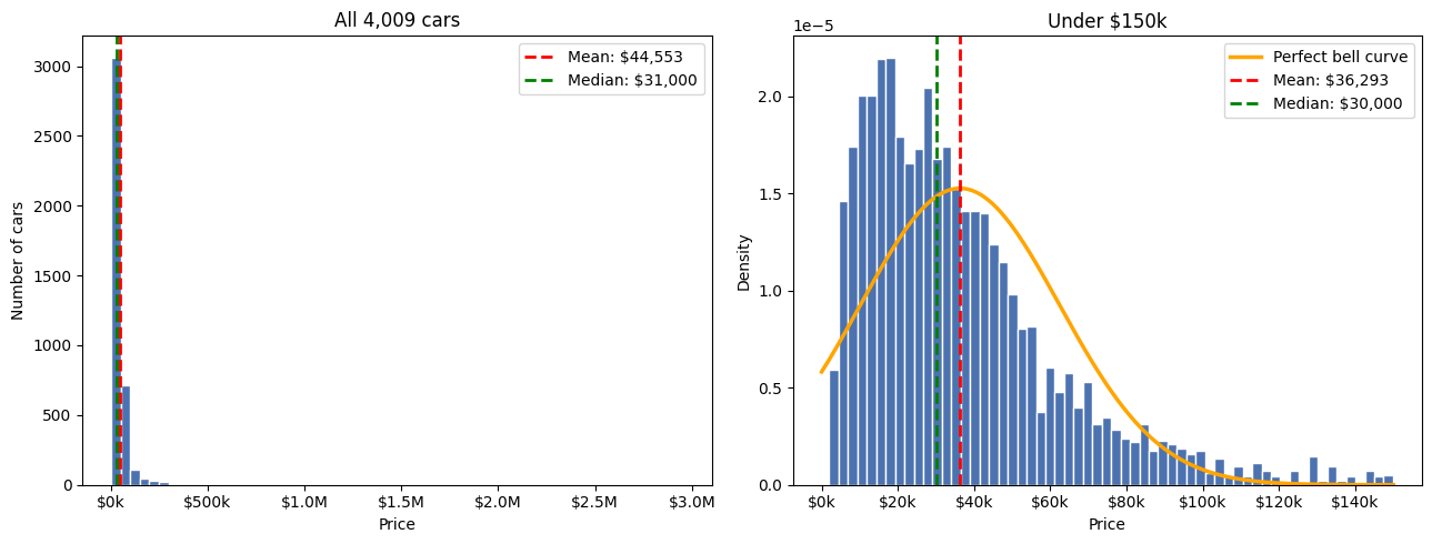
The left panel is what skewness looks like. Nearly every car is crammed against the left wall while a handful of supercars stretch the axis to $3M. The chart is basically one bar and a rumor.
The right panel is more interesting. Even after cutting the supercars, the data doesn’t match the orange “perfect bell.” The real distribution leans right, the bell awkwardly implies some cars should cost less than $0, and the mean ($36,293) still sits to the right of the median ($30,000). Skewness drops from 19.5 to 1.4 — a huge improvement, but officially still skewed. Real prices are rarely normal. (There’s a trick for this called a log transform. That’s a Prediction topic for another time).
Removing the Outliers
The chart justifies the decision. We’re building a model for normal cars, so we keep everything under $150,000. That still covers 97% of the data.
print("Before:", len(df), "cars, max price:", df['price'].max())

df = df[df['price'] < 150_000]

print("After:", len(df), "cars, max price:", df['price'].max())
print("Std deviation after filter:", df['price'].std().round(2))
Before: 4009 cars, max price: 2954083.0
After: 3889 cars, max price: 149900.0
Std deviation after filter: 26134.27
This looks a lot more workable: $78,710 before, $26,134 after. We removed 120 cars — 3% of the data — and cut the price spread by two-thirds. That’s the whole outlier lesson told by one statistic.
Building the Model
Feature Engineering: A Smarter Variable
The model_year column says when a car was made. But what really drives price is how old it is. Same information, better framing. This is called feature engineering: helping the model see what a human already knows.
df['car_age'] = 2026 - df['model_year']Picking the Features
Not every column earns its place. model has 1,898 unique values and engine has hundreds. With only ~3,900 rows, the model would just memorize them instead of learning patterns. We keep the features that generalize.
features = ['car_age', 'milage', 'brand', 'fuel_type', 'accident', 'clean_title']
target = 'price'

X = df[features]
y = df[target]
Remember this decision. We’re deliberately throwing away the information that separates a Camry from a Supra. It will come back to haunt us, and when it does, we’ll know exactly why.
Turning Categories Into Numbers
Models only understand numbers; “Ford” means nothing to them. One-hot encoding turns each category into its own yes/no column: brand_Ford = 1, brand_Toyota = 0, and so on.
X = pd.get_dummies(X, columns=['brand', 'fuel_type', 'accident', 'clean_title'])

print("Feature columns after encoding:", X.shape[1])
Feature columns after encoding: 69
Why Not Just Draw a Straight Line?
Before choosing an algorithm, I want to show the chart that made the choice for me. This is price against mileage, with two lines: the best straight line through the data (what linear regression would see), and the actual median price in each 20,000-mile bucket.
fmt_y = FuncFormatter(lambda x, _: f"${x/1000:,.0f}k")
fmt_x = FuncFormatter(lambda x, _: f"{x/1000:,.0f}k")

plt.figure(figsize=(10, 6))
plt.scatter(df['milage'], df['price'], s=8, alpha=0.25, color='#4C72B0')

# best straight line
coef = np.polyfit(df['milage'], df['price'], 1)
xs = np.linspace(0, df['milage'].max(), 200)
plt.plot(xs, np.polyval(coef, xs), color='red', linewidth=2.5,
         label="Best straight line (linear regression's view)")

# the actual pattern: median price per 20k-mile bucket
df['bucket'] = (df['milage'] // 20000) * 20000
medians = df.groupby('bucket')['price'].median()
medians = medians[medians.index <= 260000]
plt.plot(medians.index + 10000, medians.values, color='orange', linewidth=3,
         marker='o', label='Actual pattern (median price per 20k miles)')

plt.gca().yaxis.set_major_formatter(fmt_y)
plt.gca().xaxis.set_major_formatter(fmt_x)
plt.xlabel('Mileage (thousands of miles)')
plt.ylabel('Price')
plt.title("Depreciation is a curve — and a straight line can't bend")
plt.legend()
plt.tight_layout()
plt.savefig('depreciation_curve.png', dpi=150)
plt.show()

df = df.drop(columns='bucket')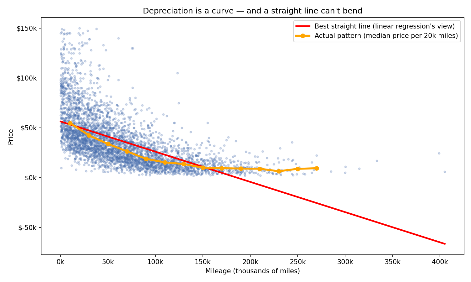
The orange line is the reality: median prices fall off a cliff — $55k near zero miles, $19k by 80k miles — then flatten onto a ~$9k floor. A 200k-mile car and a 260k-mile car cost about the same, because past a point, a running car is worth “a running car.”
The red line is linear regression’s worldview. It can’t flatten. By 300k miles it predicts a price of negative $34,531 — the seller pays you to take the car. One chart, and the core assumption of linear regression is visibly broken.
This is the reasoning behind the model choice, and it happened before any model was trained. The checklist I run on any problem:
Tabular data (rows and columns) → tree-based models dominate; neural nets only pull ahead on images, text, or millions of rows
~3,900 rows → too small for deep learning, plenty for a forest
Mixed types — 2 numeric + 4 categorical → trees handle one-hot columns natively
Non-linearity — the chart above proves it
Interactions — 100k miles should hurt a Porsche differently than a Honda, and trees find interactions automatically
Skewed target — trees don’t care about the target’s distribution; linear regression quietly suffers
Explainability — forests give feature importances for free
By item 4, the shortlist was already “tree ensemble.” The reasoning picks the shortlist; the test picks the winner. Reasoning without testing is guessing, and testing without reasoning is a fishing expedition.
Train / Test Split
This is the most important idea in all of prediction: never grade a model on data it studied from. We hide 20% of the cars. The model trains on 80%, then we test it on the 20% it has never seen — like a real exam.
from sklearn.model_selection import train_test_split

X_train, X_test, y_train, y_test = train_test_split(
    X, y, test_size=0.2, random_state=42
)

print("Training cars:", len(X_train), "| Test cars:", len(X_test))
Training cars: 3111 | Test cars: 778
Let the Models Fight It Out
Don’t take any model on faith. Line them up, same data, same split, and compare training error against test error. I included linear regression as the baseline — if a fancier model can’t beat a straight line, the fancier model isn’t worth it.
from sklearn.linear_model import LinearRegression
from sklearn.tree import DecisionTreeRegressor
from sklearn.ensemble import RandomForestRegressor, GradientBoostingRegressor
from sklearn.metrics import mean_absolute_error, r2_score

models = {
    'Linear Regression':    LinearRegression(),
    'Single Decision Tree': DecisionTreeRegressor(random_state=42),
    'Random Forest':        RandomForestRegressor(n_estimators=200, random_state=42),
    'Gradient Boosting':    GradientBoostingRegressor(random_state=42),
}

for name, m in models.items():
    m.fit(X_train, y_train)
    train_mae = mean_absolute_error(y_train, m.predict(X_train))
    test_mae = mean_absolute_error(y_test, m.predict(X_test))
    r2 = r2_score(y_test, m.predict(X_test))
    print(f"{name:22s} train MAE ${train_mae:>7,.0f} | "
          f"test MAE ${test_mae:>7,.0f} | R² {r2:.2f}")
Model |
Train MAE |
Test MAE |
R² |
|---|---|---|---|
Linear Regression |
$11,881 |
$12,693 |
0.55 |
Single Decision Tree |
$50 |
$14,393 |
0.34 |
Random Forest |
$3,966 |
$11,495 |
0.58 |
Gradient Boosting |
$10,095 |
$10,972 |
0.62 |
Three lessons in one table.
Linear regression does about what the depreciation chart predicted: it can’t bend, and it pays for it.
The single decision tree is the villain. A training error of fifty dollars — it memorized every car — followed by the worst test error of the four. That train/test gap is the most vivid demonstration of overfitting you’ll ever see, and it’s why nobody ships a lone tree.
Random forest is the fix for the tree’s flaw. Build 200 trees, each on a random slice of the data, and average them. Each tree still overfits its slice, but they overfit in different directions, and the errors cancel out. Memorization averages away; real patterns survive.
And the honest wrinkle: gradient boosting actually won, by about $500. I’m sticking with random forest for this post anyway. It works nearly at its best straight out of the box, while boosting is the temperamental thoroughbred — more sensitive to tuning, easier to overfit if you push it, harder to explain. Tuning boosting is more complex topic.
model = RandomForestRegressor(n_estimators=200, random_state=42, oob_score=True)
model.fit(X_train, y_train)
(Note oob_score=True. We’ll need it shortly.)
Testing the Model
One number never tells the whole story. We grade the model from several angles, all on the 20% of cars it has never seen.
from sklearn.model_selection import cross_val_score
from sklearn.metrics import mean_absolute_error, mean_squared_error, r2_score

preds = model.predict(X_test)

# MAE — the honest average miss, in dollars
mae = mean_absolute_error(y_test, preds)
print(f"MAE:  ${mae:,.0f}")

# RMSE — punishes big misses (errors are squared before averaging)
rmse = np.sqrt(mean_squared_error(y_test, preds))
print(f"RMSE: ${rmse:,.0f}")

# R² — share of price variation explained (1.0 = perfect, 0.0 = useless)
r2 = r2_score(y_test, preds)
print(f"R²:   {r2:.3f}")

# MAPE — average miss as a percentage of the true price
mape = np.mean(np.abs(y_test - preds) / y_test) * 100
print(f"MAPE: {mape:.1f}%")

# "Accuracy" for regression — how often do we land within X%?
errors_pct = np.abs(y_test - preds) / y_test
print(f"Within 10% of true price: {(errors_pct <= 0.10).mean()*100:.0f}%")
print(f"Within 20% of true price: {(errors_pct <= 0.20).mean()*100:.0f}%")
print(f"Within 30% of true price: {(errors_pct <= 0.30).mean()*100:.0f}%")

# Cross-validation — was our test set just lucky?
cv_scores = -cross_val_score(
    RandomForestRegressor(n_estimators=200, random_state=42),
    X, y, cv=5, scoring='neg_mean_absolute_error'
)
print("MAE across 5 splits:", cv_scores.round(0))
print(f"Average: ${cv_scores.mean():,.0f} ± ${cv_scores.std():,.0f}")

# The sanity check — beat the dumbest possible model
baseline_mae = mean_absolute_error(y_test, np.full(len(y_test), y_train.mean()))
print(f"Always-guess-average MAE: ${baseline_mae:,.0f}")
MAE: $11,495
RMSE: $17,471
R²: 0.585
MAPE: 37.8%
Within 10% of true price: 20%
Within 20% of true price: 39%
Within 30% of true price: 56%
MAE across 5 splits: [13450. 10501. 10546. 9789. 10835.]
Average: $11,024 ± $1,261
Always-guess-average MAE: $20,343
What All These Numbers Mean
MAE: $11,495. On a typical car, the guess is off by about $11,500. It’s the most honest number of the bunch: average miss, in dollars.
RMSE: $17,471. Same question, but big misses count extra. The useful part is the gap against MAE: $6,000. If errors were uniform, the two would be close. A gap this size means most predictions are decent but a subset of cars gets badly whiffed.
R²: 0.585. The model explains about 59% of why prices differ. The other 41% lives in things it can’t see: trim, condition, options, seller desperation.
MAPE: 37.8%. Average miss as a percentage. Keep this one; it’s the number the literature has a scale for.
Within 10/20/30%: 20% / 39% / 56%. There’s no true “accuracy” score when predicting dollar amounts — a prediction is never exactly right — so this is the honest substitute. Read it as a customer would: a 1-in-5 chance of landing within 10% of the true price, about a coin flip of landing within 30%. Useful for ballparks, not for writing checks.
Cross-validation: $11,024 ± $1,261. Five different train/test splits, five separate exams. The scores hover around $10–11k with one grumpier fold at $13.4k. No wild swings, so the single test result wasn’t a lucky draw. When you report performance, this is the number to cite.
Always-guess-average: $20,343. The floor. A “model” with zero intelligence — predicting $36k for every car — misses by $20,343. Ours misses by $11,495. That comparison is the verdict: the model cut the dumbest possible error nearly in half, which is proof it learned real patterns rather than noise.
What Do The Results Say About the Model
I know. That’s the honest reaction, and it deserves a straight answer, because “is it good?” is the wrong question. The right ones are “better than what?” and “good enough for what?”
Better than what? Better than knowing nothing, by a lot — half the naive error, using six features and zero tuning.
Good enough for what? Ballparks, yes. Transactions, no. Real pricing tools land within a few percent, but they’re using exact trim, options packages, condition grades, and millions of listings. We fed our model six columns and 3,100 training cars. It’s not a bad student; it took a hard exam with a sixth of the textbook.
And we know exactly where the missing accuracy went, because we chose to throw it away. Back in the feature selection step, we dropped model and engine — which means the model literally cannot tell a Camry from a Supra. Both are “Toyota, gasoline, clean title.” Of course it misses by $11k on cars like that. The information that separates them was never in the room. That’s also exactly what the RMSE gap was flagging.
Closing the Gap
There’s a second objection, and it’s sharper. Look back at the bake-off table: the random forest’s training error was $3,966, but its test error was $11,495. A $7,500 gap. Isn’t that textbook overfitting? And if it is, why should you trust any of the numbers above?
That instinct is correct for most models. For random forests specifically, training error is a rigged number: every tree partially memorized its bootstrap sample, so asking the forest about training cars is letting students grade their own homework. The fair comparison is against the out-of-bag estimate.
Out-of-Bag: The Forest’s Built-In Second Opinion
Each of the 200 trees trains on a random ~63% of the training cars. The other ~37% are “out-of-bag” for that tree. Scoring every car only with trees that never saw it gives a free validation set, with no extra split needed.
oob_preds = model.oob_prediction_

print("OOB R²:  ", round(model.oob_score_, 3))
print(f"OOB MAE:  ${mean_absolute_error(y_train, oob_preds):,.0f}")
print(f"OOB RMSE: ${np.sqrt(mean_squared_error(y_train, oob_preds)):,.0f}")
OOB R²: 0.619
OOB MAE: $10,730
OOB RMSE: $15,980
Now line up every independent estimate of this model’s quality:
Validation method |
MAE |
RMSE |
R² |
|---|---|---|---|
Out-of-bag (inside training data) |
$10,730 |
$15,980 |
0.619 |
5-fold cross-validation |
$11,024 ± $1,261 |
— |
— |
Holdout test set |
$11,495 |
$17,471 |
0.585 |
Three methods, three different ways of slicing the data, and they converge on the same answer: MAE ≈ $11k, R² ≈ 0.6. That convergence is the evidence. If the model were secretly overfit, OOB and cross-validation would look rosy while the test set collapsed. They don’t. The fair generalization gap is OOB vs test — about $765 — not $7,500.
The Experiment That Settles It
If the train/test gap were genuinely harmful, then forcing the trees to memorize less should close the gap and improve test error. min_samples_leaf does exactly that: it stops a tree from splitting down to a single car.
for leaf in [1, 5, 20, 50]:
    m = RandomForestRegressor(n_estimators=200, random_state=42, min_samples_leaf=leaf)
    m.fit(X_train, y_train)
    train_mae = mean_absolute_error(y_train, m.predict(X_train))
    test_mae = mean_absolute_error(y_test, m.predict(X_test))
    print(f"min_samples_leaf={leaf:>2}  train ${train_mae:>7,.0f} | "
          f"test ${test_mae:>7,.0f} | gap ${test_mae - train_mae:>6,.0f}")
min_samples_leaf |
Train MAE |
Test MAE |
Gap |
|---|---|---|---|
1 (default) |
$3,966 |
$11,495 |
$7,529 |
5 |
$8,812 |
$12,000 |
$3,188 |
20 |
$11,421 |
$12,548 |
$1,127 |
50 |
$12,573 |
$13,418 |
$845 |
The gap shrinks from $7,529 to $845 — and test error gets worse at every step. The gap was cosmetic. Killing it killed accuracy.
So the defensible statement is this: OOB, cross-validation, and a holdout test independently agree that this model misses by about $11k and explains about 60% of price variation. That’s reliably measured mediocrity — the ceiling set by six features — not hidden overfitting. Confidence in the measurement, humility about the model. Those are different things.
What Drives the Price?
A prediction you can’t explain is a prediction you can’t trust. The forest keeps score: every time a feature helps split cars into cheaper and pricier groups, it earns credit.
importances = pd.Series(model.feature_importances_, index=X.columns)
print((importances.sort_values(ascending=False).head(5) * 100).round(1))
milage 57.0
car_age 14.9
brand_Porsche 4.6
brand_Mercedes-Benz 1.9
brand_BMW 1.6
But one-hot encoding is hiding something. We shattered brand into 57 separate columns, so its credit is scattered. To judge brand fairly, add its pieces back up.
grouped = {}
for col, value in importances.items():
    if col.startswith('brand_'):
        grouped['brand'] = grouped.get('brand', 0) + value
    elif col.startswith('fuel_type_'):
        grouped['fuel_type'] = grouped.get('fuel_type', 0) + value
    elif col.startswith('accident_'):
        grouped['accident'] = grouped.get('accident', 0) + value
    elif col.startswith('clean_title_'):
        grouped['clean_title'] = grouped.get('clean_title', 0) + value
    else:
        grouped[col] = value

grouped = pd.Series(grouped).sort_values(ascending=False)
print((grouped * 100).round(1))

(grouped * 100).sort_values().plot(
    kind='barh', figsize=(9, 5), color='#4C72B0', edgecolor='white'
)
plt.xlabel("Share of the model's decisions (%)")
plt.title("What actually drives a used car's price")
plt.tight_layout()
plt.savefig('feature_importance.png', dpi=150)
plt.show()
milage 57.0
brand 22.3
car_age 14.9
fuel_type 2.9
clean_title 1.8
accident 1.1
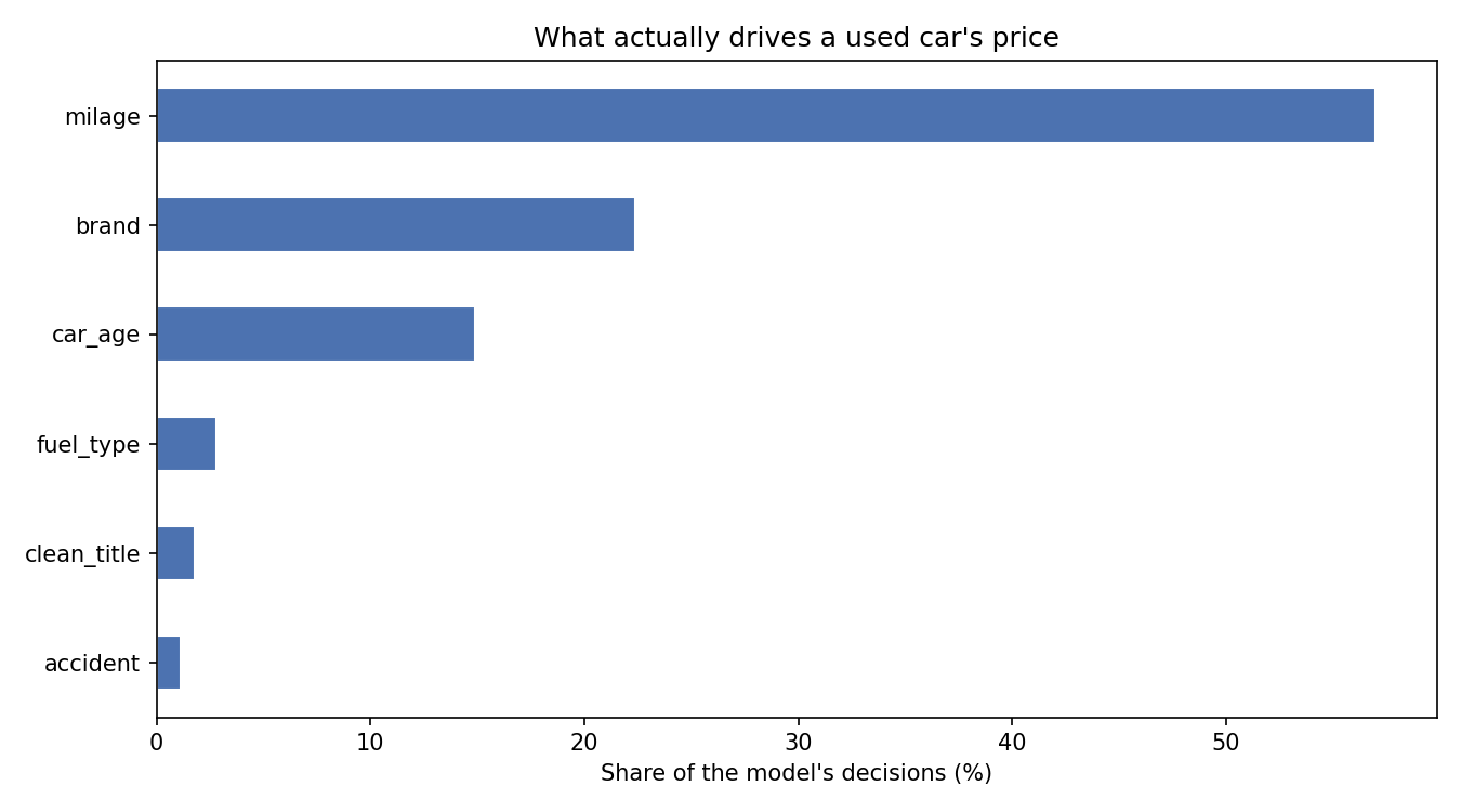
Mileage, and it isn’t close. Mileage beats age: how a car was used matters more than when it was born. A garage-kept 2015 outprices a highway-warrior 2019. The plain correlations back it up — mileage at −0.60 against price, age at −0.53.
The one-hot trap. In the raw ranking, brand looked like an also-ran; its best column, brand_Porsche, sat at 4.6%. Regrouped, brand is the #2 driver at 22%. Beginners get burned by this constantly: they see their categorical feature nowhere in the importance list and wrongly conclude it doesn’t matter.
The accident surprise. Accident history registers at just 1.1%. That feels wrong until you think it through: cars with accidents also tend to have higher mileage and more age, so by the time the model has used those, the accident column adds little new information. That’s the difference between “doesn’t matter” and “already accounted for.”
The Payoff: Pricing a Real Car
new_car = pd.DataFrame([{
    'car_age': 2026 - 2019,
    'milage': 45_000,
    'brand': 'Toyota',
    'fuel_type': 'Gasoline',
    'accident': 'None reported',
    'clean_title': 'Yes',
}])

# Encode it the same way, then align columns with the training set
new_car = pd.get_dummies(new_car)
new_car = new_car.reindex(columns=X.columns, fill_value=0)

print(f"Predicted price: ${model.predict(new_car)[0]:,.0f}")
Predicted price: $38,949
A 2019 Toyota with 45,000 miles at $39k. Plausible for a Highlander, high for a Corolla — and the model can’t tell which one you meant. That’s the six-feature ceiling in a single sentence.
What the Literature Says
I don’t want you to take any of the claims above on my word, so here’s where they come from.
The train/test gap is expected, not a defect. In the paper that introduced the algorithm, Breiman (2001) argued that random forests do not overfit as more trees are added, as a consequence of the Law of Large Numbers. Individual trees memorize; the forest’s generalization error converges. Published used-car work shows the same signature: Pahwa et al. (2017), working on a Kaggle dataset, reported roughly 84% accuracy on test data against 95% on training data — a wider gap than ours, in a paper presenting a successful model.
Out-of-bag validation is legitimate. Breiman and Cutler’s own documentation states that random forests need neither cross-validation nor a separate test set to obtain an unbiased estimate of test error, because the out-of-bag data provides it internally. Hastie, Tibshirani, and Friedman (2009), in The Elements of Statistical Learning, note that OOB estimates are nearly identical to n-fold cross-validation. Bénard et al. (2021) later proved formally that the OOB error consistently estimates the forest’s generalization error. One caveat worth knowing: Janitza and Hornung (2018) found that in some classification settings OOB overestimates the true error. Note the direction — if OOB is biased, it’s biased pessimistic. That makes the agreement between OOB, CV, and test in our results more convincing, not less.
A 38% MAPE is “reasonable,” not “useless.” Lewis (1982) proposed the scale that most forecasting papers still use: MAPE under 10% is highly accurate, 10–20% is a good forecast, 20–50% is reasonable, and over 50% is inaccurate. Our 37.8% sits in “reasonable” — the ballparks-not-transactions verdict, now with a citation. MAPE has known flaws, though: Fildes (1992) showed it systematically favors forecasts that undershoot, which is why MAE and R² should sit beside it rather than replace it.
Our R² is where a six-feature model should be. Feature count drives everything in the published used-car work. A linear model on 150,000 German listings using only registration year and mileage explained just 34% of price variance. A random-forest-vs-linear comparison with a modest feature set reported R² of 0.68 against 0.57 — almost exactly our 0.58 against 0.55. With 19 engineered features, a random forest reached 0.82. With optimized feature selection, 0.92. The path from 0.58 to 0.8+ runs through features, not algorithms.
A caution on sourcing: several of the car-pricing papers are from smaller venues, and R² figures above 0.97 in some of them should be read skeptically — numbers that good on used-car data often signal leakage. The load-bearing citations for the argument in this post are Breiman (2001), Hastie et al. (2009), and Lewis (1982). The car-pricing papers are context, not proof.
The Whole Game
Every prediction project — car prices, sales forecasts, churn — follows the same skeleton:
load → clean → explore → engineer → encode → split → train → test → explain
The model we built is reliably measured, honestly limited, and fully explainable. It cuts the naive error in half, three independent validation methods agree on its performance, and we can name the price of every simplification we made.
In a more in depth prediction, we cash those simplifications in: parse model and engine into usable features, predict log(price) instead of price, and let gradient boosting off the leash. If the reasoning in this post is right, the error should drop — and we’ll measure it the same three ways to make sure.
References
Bénard, C., Da Veiga, S., & Scornet, E. (2021). MDA for random forests: inconsistency, and a practical solution via the Sobol-MDA. arXiv:2102.13347.
Breiman, L. (2001). Random Forests. Machine Learning, 45(1), 5–32.
Breiman, L., & Cutler, A. Random Forests (documentation). Berkeley Statistics Department.
Fildes, R. (1992). The evaluation of extrapolative forecasting methods. International Journal of Forecasting, 8(1), 81–98.
Hastie, T., Tibshirani, R., & Friedman, J. (2009). The Elements of Statistical Learning (2nd ed.). Springer.
Janitza, S., & Hornung, R. (2018). On the overestimation of random forest’s out-of-bag error. PLoS ONE, 13(8).
Lewis, C. D. (1982). Industrial and Business Forecasting Methods. Butterworths.
Pahwa, N., et al. (2017). How much is my car worth? A methodology for predicting used cars prices using Random Forest. arXiv:1711.06970.