

R vs Python the Ultimate Question
Working in this industry for well over a decade, the question, which is better, R or Python, comes up every so often. Python has always been my go-to language, and for many years that’s what I would say.
But experience has a way of changing you. Now, my answer has evolved into an eloquent analogy:
“Which car do you prefer? A convertible or SUV?”
Most people will answer one or the other. Then, I lay out this scenario:
It’s December 23rd, and you’ve arrived at Chicago O’Hare. When you were landing, you noticed the streets were covered in snow. Your rental is waiting for you. You are given the option between a convertible and a 4x4 SUV. Which would you choose?
Now, let’s say you are arriving in Miami and those are my options. A convertible, even in the winter, is more likely to be the choice.
Similarly, choosing between the two languages largely depends on the application.
When Do I Choose Python?
Honestly, I don’t have much of a process to select the language I will use. However, I do follow a few guidelines that determines the outcome.
The one rule of thumb I use is, if it needs to run or does something, rather than just analysis, Python is my go to.
Think of the requirements as a whole. If a project that demands automation, software integration, machine learning pipeline, or production systems where analysis is just a part of a greater environment, Python is a better choice.
For example, if data is continuously being downloaded, cleaned, and a prediction model applied, then you have your answer.
When R is a Better Choice?
The primary objective of R is statistical analysis, inference, and data visualization. It is a fantastic tool to help you understand relationships in the data, test hypothesis, estimate effects, and communicate findings.
But that is for analysis only, and the output is a report that doesn’t need to integrate with a greater system.
Another great usage of this language is for visualization. The graphs it puts out is far better than when done in python.
The graph below, was done using R ggplot2 package. The data is a fraction of a much larger dataset. For showcasing purposes, I just selected a few lines.
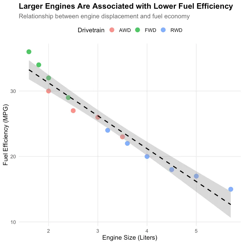
To me, this is a nice and clean graph. It can be easily adjusted with a few tweaks here and there.
Similarly, the next graph was done in Python with matplotlib package. I could use seaborn to add a flair to the graph, but for the showcase purposes, I left it at this.
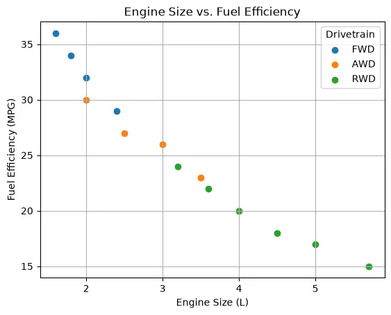
It is not a bad graph by any means, but, in my opinion, it is not as nice and sharp as the previous one.
No comments yet. Be the first.