
FIELD NOTE
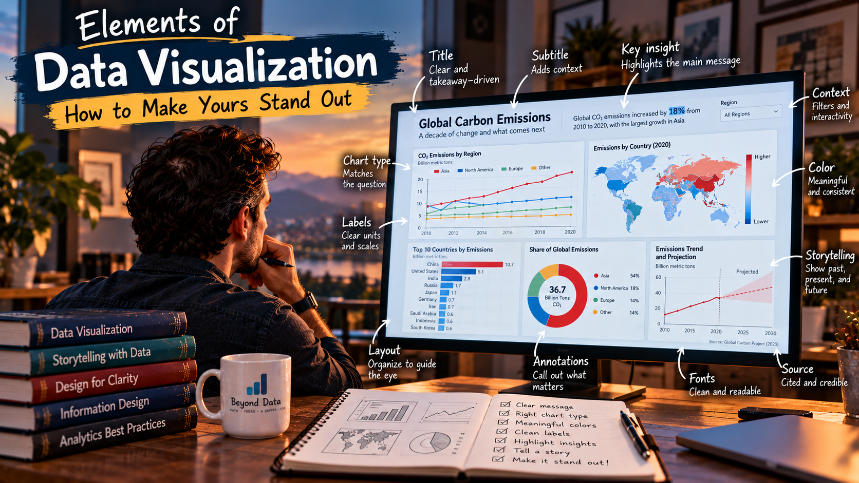
Elements of Data Visualization -- How to Make Yours Stand Out
Data visualization has become part of our daily lives. All you have to do is login to an platform and you are immediately directed to a dashboard with fancy graphs. Our eyes have become so accustumed to seeing these diagrams that unless one stands out, we are likely to ignore them.
That could be a problem, specially when you are trying to convey a message and catch someone’s attention.
Trying to understand how can I create data visualizations that stand out, I analyzed multiple research papers. All out of all the consumed information, I was segregated three essential elements that could make it or break it your visualization: narrative and structure, titles and captions, rhetorical framing.
Narrative and Structure
Creating data storytelling, believe it or not, is controversial. Some experts say that a narrative risks manipulation, commercial bias, and it often distort the facts.
There is no easy way to say this: presenting data is never entirely neutral. The very act of deciding what to show, what to omit, and how to present it introduces a level of subjectivity.
Consider this graph.
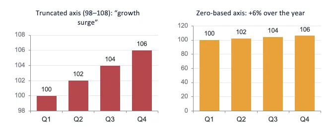
They are exactly the same number presented a little different. When you look at the one on the left, you can immediately tell there was growth. The one on the right, even though are the same numbers, depict a flattening image.
To the viewer, a story will be formed. You are either telling it, or allowing them to form one in their heads.
Numbers rarely speak for themselves. Adding a narrative to numerical information can make complex topics more accessible to general audiences. Borkin et al. (2013) explain that a range of individual and contextual factors influence how the audience process the visual information.
Segel and Heer (2010) mentioned something that I didn’t think about. Cultural factors, particularly the reading order, can affect the viewer interpretation. The Westerner eye will naturally read from left to right. Layout and placement could affect how they interpret a graph.
Titles and Captions
These are, arguably, the most underrated elements of visualization. They dictate how an audience interprets the visual evidence, serving as a bridge between raw data and comprehension.
Titles have the highest fixation recognition (Borking et al., 2016). Title and caption shape how reader interpret and recall the information. Captions can capture the reader’s attention to the area where you want them to view.
Rhetorical Framing
Data storytelling serves multiple functions beyond simply communicating information. More recently, greater attention has been given to the persuasive function of data storytelling.
Specific techniques promote cognitive engagement and credibility are very effective tools in visual persuasion. Storytellers have often employed visual rhetoric design to guide audiences’ interpretation and evoke their cognitive or emotional responses to align with the intended message (Li et al., 2026).
Framing involves how best to articulate an argument establishing the principal premises to be conveyed visually (Kashaka, 2026).
What AI Doesn’t Provide
With the rise of LLM’s, to create graphics, or even a dashboard, all it takes one prompt and a dashboard is created.
The output is generic with little personalization. None of the graphs are catchy. To illustrate what you can do with visualization, I decided to tackle a question that has been debated to death and in every sports circles: Who is the greatest basktball player of all time?
The debate is often around 2 players, Michael Jordan and Lebron James. The purpose of this exercise is not to determine which player is objectively the GOAT. But it is to demonstrate the methods I’ve come to learn.
Using two leading models, GPT-6 Astra (ChatGPT) and Opus 5.5 (Claude), I used the same prompt for both.
Without judging which turned out better, here are the results.
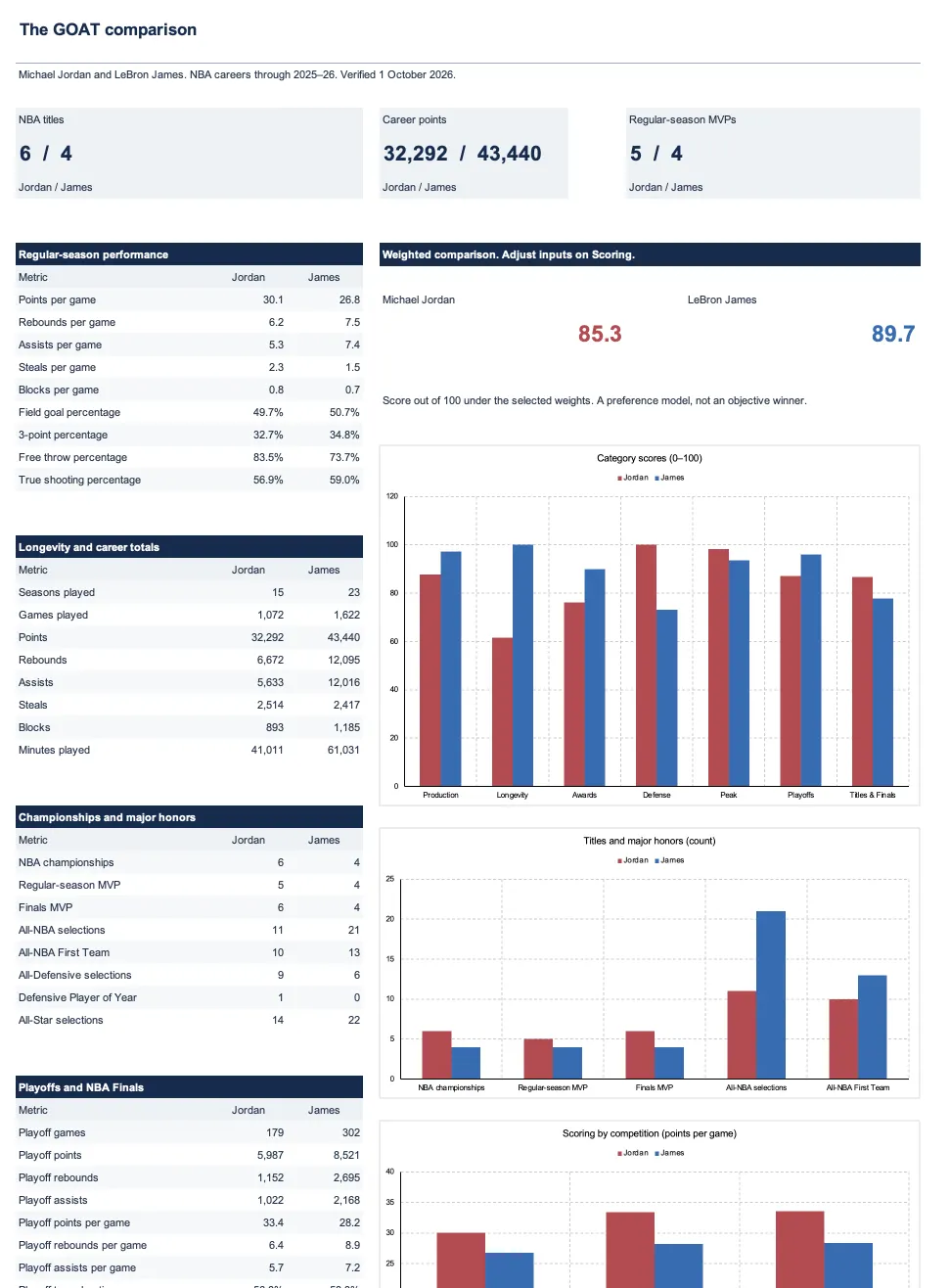
ChatGPT Results
It provided me with a spreadsheet with a very long page showing the results. It is hard to read and it took me a minute to figure out all the numbers.
Claude Results
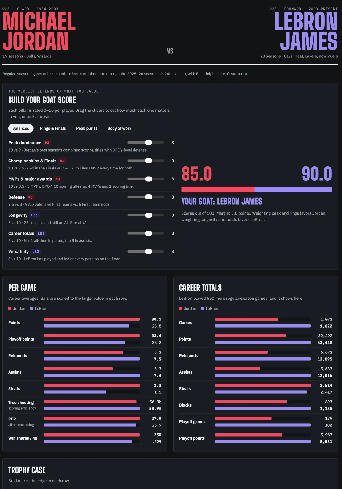
In a similar manner, Claude provided me a dashboard with similar numbers. The file was saved as html, and it just as long.
It is graphically more appealing to read than the output of its counterpart, but still a very generic dashboard by nature.
Persuasive Visualization
In both cases, the visualization can be adjusted using more prompts. But it lacks personality.
At the same time, if you are trying to tell a story and convey a message to your audience, building something more compelling is key. Because, the way you present it can make a huge impact.
Michael Jordan Bias
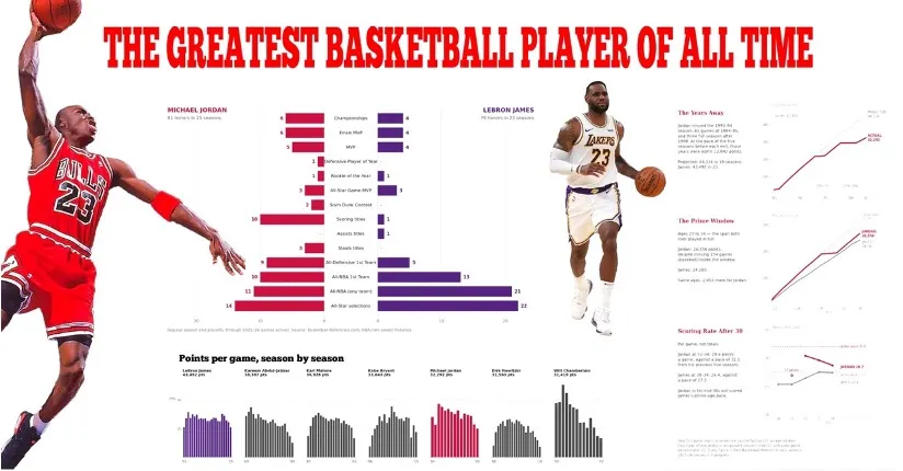
The graph above displays certain metrics that are mostly favored to Michael Jordan. The central pyramid is ordered so that the rarest honors, where Jordan leads, sit a the center of the graph.
The red title, where the eyes tend to land, is usually associated with Jordan as it is the Chicago Bulls colors.
Note that all the number are accurate and none of these elements are distorted. Yet, it is easier for a conclusion to be made.
Lebron James Bias
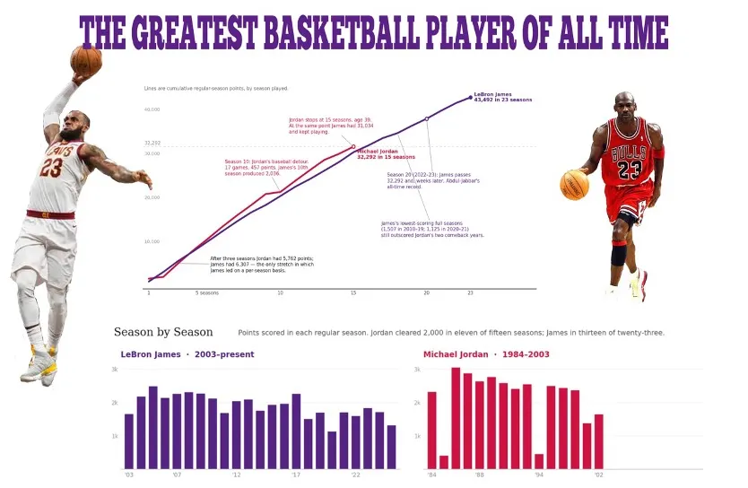
In this graph I have James on the left. The larger figure draws the eyes, specially for Westerners who read from left to right. The center graph focuses on the points, where James prevails.
Further the titles and primary colors shifted to a Lakers purple, where people tend to associate the player.
On the bottom, the two bar graphs is a breakdown of points where, again, James leads by a lot.
Conclusion
Effective data visualization is more than technical accuracy or the ability to generate visually appealing graphs.
Narrative and structure provide context, titles and captions guide attention and interpretation, and rhetorical framing determines which aspects of the evidence receive emphasis. As demonstrated by the Jordan and James visualizations, the same body of accurate data can support markedly different arguments depending on the choices made by the designer.
These choices become particularly important across industries, where audiences differ in domain knowledge, expectations, and decision-making responsibilities. For junior data science professionals, effective visualization therefore requires an understanding not only of the data, but also of the audience and the cognitive and rhetorical principles that shape how that data will be interpreted.
As visualization tools become increasingly automated, these communication skills become more, rather than less, important.
References:
Basketball Statistics & History of Every Team & NBA and WNBA Players. (n.d.). Basketball-Reference.Com. Retrieved September 12, 2026, from https://www.basketball-reference.com
Borkin, M. A., Bylinskii, Z., Kim, N. W., Bainbridge, C. M., Yeh, C. S., Borkin, D., Pfister, H., & Oliva, A. (2016). Beyond Memorability: Visualization Recognition and Recall. IEEE Transactions on Visualization and Computer Graphics, 22(1), 519–528. https://doi.org/10.1109/TVCG.2015.2467732
Borkin, M. A., Vo, A. A., Bylinskii, Z., Isola, P., Sunkavalli, S., Oliva, A., & Pfister, H. (2013). What Makes a Visualization Memorable? IEEE Transactions on Visualization and Computer Graphics, 19(12), 2306–2315. https://doi.org/10.1109/TVCG.2013.234
Kashaka, N. D. (2026). Data Visualization as Cultural Rhetoric: Persuasion, Uncertainty, and Trust. IDOSR JOURNAL OF ARTS AND HUMANITIES, 12(1), 1–10. https://doi.org/10.59298/IDOSRJAH/2025/121110000
Li, Z., Zheng, C., Li, Z., & Shi, Y. (2026). Data Speaks, But who Gives It a Voice? Understanding Persuasive Strategies in Data-Driven News Articles. IEEE Transactions on Visualization and Computer Graphics, 32(1), 1339–1349. https://doi.org/10.1109/TVCG.2025.3642509
Segel, E., & Heer, J. (2010). Narrative Visualization: Telling Stories with Data. IEEE Transactions on Visualization and Computer Graphics, 16(6), 1139–1148. https://doi.org/10.1109/TVCG.2010.179