
Can a Human Being Live to 300 Years? A Machine Learning Exercise
The answer has been long sought by more than scientists and doctors. In fact, the first person who had the idea to record death was neither a scientist or medical doctor. It was a statistian: John Graunt
How long can a human live?
The answer has been long sought by more than scientists and doctors. In fact, the first person who had the idea to record death was neither a scientist or medical doctor. It was a statistian: John Graunt
Understanding life expectancy (LE) is essential in many disciplines. Aside from the scientifical standpoint of trying to understand what causes death, forecasting the longetivity of the population is a important component for public policy.
According to the CDC, today, the LE in the USA is 79.0. If, for some miraculous reason, that number spikes to 89 overnight, social programs like medicare and social security would be facing a difficult predicament.
The question still remains, how long can a human live?
The Bible tells us that Methuselah, a patriarch in the book of Genesis, is recorded to have lived to 969 years. Although, his life and age has not been historically or scientifically confirmed, the thought of someone living that long is attainable in today’s age.
The oldest person recorded, and scientifically confirmed, was Jeanne Louise Calment, which is amazing. Is this as far as someone can go?
What I’ve done, as I often do, was to turn to data for find answers.
No Math, Just Line
In 1845, the LE of a white American was roughly around 38 to 43 with some variation depending on location. Today, at 79, with the exception of a few major events like pandemic, world war, the LE has been climbing steadily.
Researching the subject, I came across the Health System Tracker website listing the LE for comparible countries to the USA.
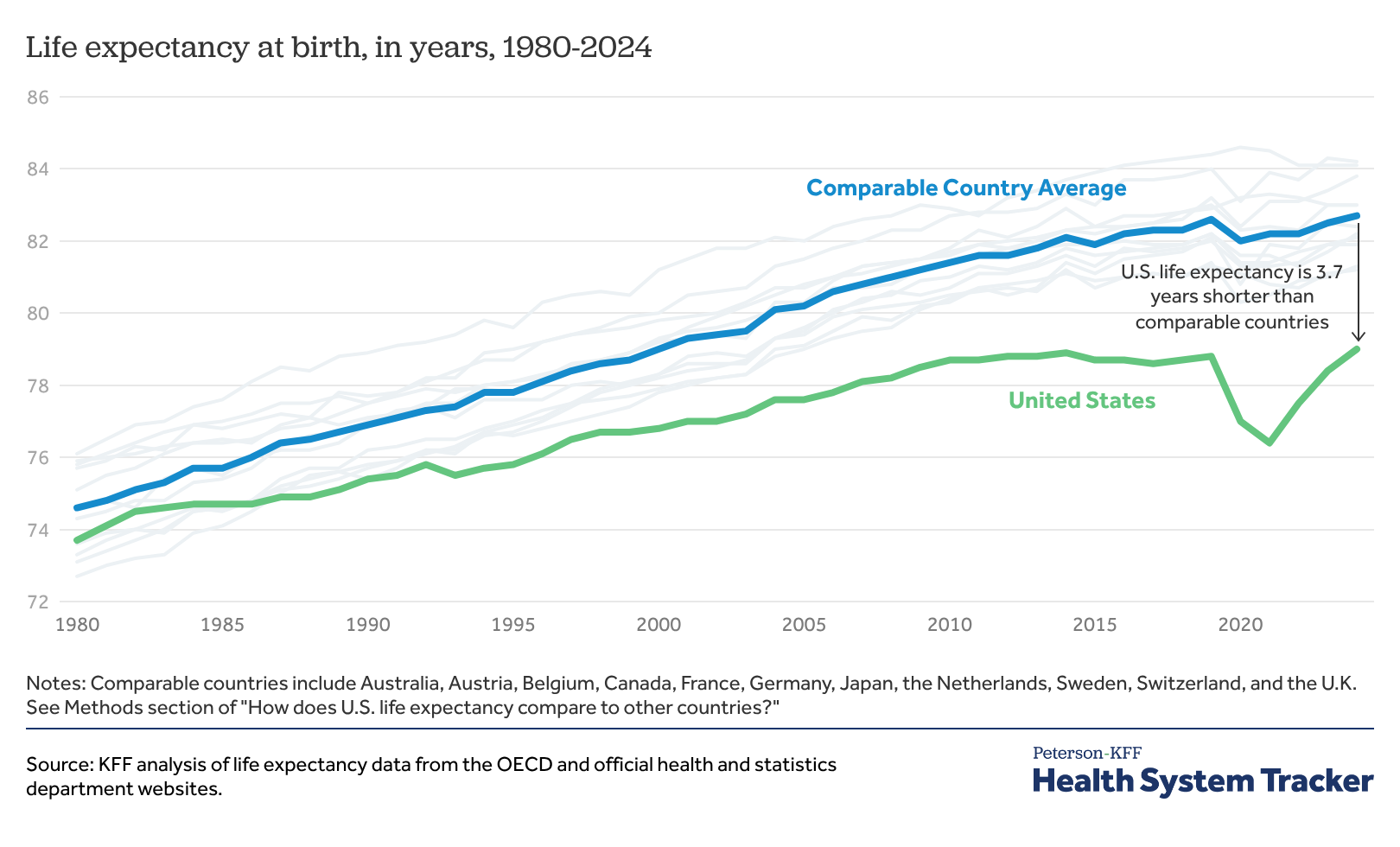
This chart shows LE at birth. From 1980 to 2019, the graph is almost a straight line. Then, of course, COVID happened and you can see a drastic dip, much more prominent in the USA than other countries. The straight line is perfect for a classic linear regression.
I downloaded the data and went to work.
The Model
Graunt’s early work was able to predict patterns like birth, death rates, and sex ratios. Likewise, using a machine learning could help us to answer the question posed in the introduction.
Because of the straight line, I decided to use a simple linear regression. A quick run using the Pearson’s correlation coefficient told me there was a strong correlation between the variables, making the data suitable for the model I chose.
\(y\) The predicted value you want to find.
\(x\): The input or independent variable.
\(b_{0}\): The y-intercept (the value of \(y\) when \(x\) is zero).
\(b_{1}\): The slope (how much \(y\) changes when \(x\) goes up by one unit.
I played around with the numbers a bit and looking at the results, when something occurred to me. What would it be like in the year 3000? Why not take a look.
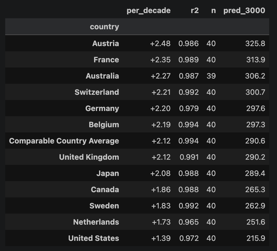
The difference between the US and Austria is devastating.
Now comes the interesting part. We are entering into a Charles Box’s Theory realm: All models are wrong, but some are useful.
This model doesn’t account for epidemics, wars, famines, and other catastrophic events where could drastically affect life expectancy. Additionally, the data only goes back 1980 years. In the great scheme of things, that is a very short time. I’m not super confident using 40 years of data to plot what will happen in the next 1,000.
The other critical element that must be pointed out, I did the projection based on data from 1980 to 2019. In the following two years, the United States and the world, took a hit due to COVID.
I still think the model is valid and useful for certain cases. Why do I think that?
Let’s check the different gauges and levers to see what it tells us. Some experts call this process “Interrogating the Model.”
Interrogating the Model
On my first job, I worked for a company that made plastic plumbing parts. With five large injection machines, setting those up required several very strict instructions and they had to be followed perfectly.
First, the machine’s temperature had to be purged from previous plastic residues and cooled. The mold had to fit perfectly into the slot and bolts tied. The raw material had specific specs on temperature, humidity, and density. Before the machine could start pumping parts, many different numbers had to be checked and be within a certain range for the product to pass quality control. If something was off, the parts would come out warped, fragile, not functional, or have any item from a long list of issues.
To that end, a model is similar. All of the numbers must be within a certain range to determine its usefulness. Using the tools available to us, we can investigate if the model is working.
R-Squared (\(R^2\))
The R-Sqaured, also known as the coefficient of determination, is a statistical measure that shows how well the the independent variable (year or time) in a regression model explains the variance of the dependent variable (life expectancy).
When checking a model, in some cases, there are benchmarks. A number that will tell you if the model is acceptable or not. Not for R-squared. The score heavily depend on the subject and they can vary heavily. For instance, a 0.90 (90%) might be the right number in a physics lab. Whereas, in psychology, a 0.20 (20%) could be considered a breakthrough.
In our case, for a national statistics tracked over four decades, we should expect something high.
My result was 97%.
What does that mean exactly? Between the years of 1980 and 2019, the size of our sample, 97% of those hits were within the area of acceptance surrounding the straight line. Proving that there is a strong correlation between the variables.
This number alone cannot tells us that this is a great model.
Residual Plots
The residual plots is the health check of the model.
The residual is the distance or error between what the line guessed and what the actual historical point is.
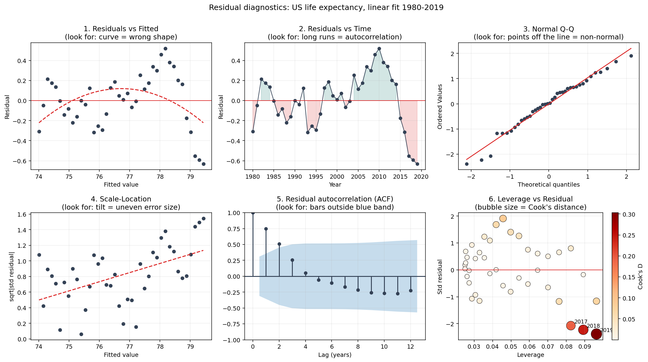
All of these different graphs tell a different story.
I want to bring your attention to panel 2 from the image above. You can see eleven consecutive dots above the line, the an plunge. That is a very telling sign. From 2000 to 2014, the LE in the USA was beating the trend, and was moving in a positive direction above the expectations. But in 2015, all of that began to change. This residual plot draws mortality stagnation.
While the numbers were still within the acceptable result, they shows us a concerning trend. The LE line for the USA was flattening. Of course, I don’t count 2020 and 2021. But certainly something that has alarmed experts.
Residual Autocorrelation
Now let’s look at Panel 5, one of my favorite graphs, the ACF. What does the residual autocorrelation mean?
In the data science world, the word “residual” means mistake. The function asks: how strong does each residual resemble the one before? Each of bar is a lag. The shaded band around it could be pure chance. And the bars poking out are the real memory.
In other words, inside the band are the lags have correlation so weak that they are indistinguishable from random noise. For instance, if you try to use a lag inside the band to predict next year’s life expectancy, any accuracy achieved would be more like a mathematical coincidence.
Looking at the plot, Lag 1 is expectedly strong, and the next 2 are the only ones that push outside the band, making them the only statiscally significant relationship.
Not very reassuring. But not fatal either.
Four Models, One Dataset
One thing to keep in mind, we are using 40 years of data attempting to predict the next thousand years. Even for someone less skeptical than me, would be a long shot. The idea is interesting, but the method is debatable at best.
When using a straight line to guess LE, we are assuming that human beings are going to improve forever. For fun, I tried a couple other methods and got different answers. Here is what I got.
Model |
R-Squared |
Year 3000 |
|---|---|---|
Linear |
0.9938 |
291 years |
Quadratic |
0.9957 |
~608 years |
Cubic |
0.9958 |
~1940 years |
Logistic |
0.9957 |
98 years |
Conclusion
Back to the original question, how long can a human live?
The biggest take away from this exercise is that the answer is unconclusive. We do know that a liner regression is useful baseline method that provides a very solid prediction within strict limits. If I was using this method for a real-world decision-making, I would say that a 10-year prediction is far more appropriate, and I would be much more confident in those numbers.
However, seeing the LE line constantly climbing makes you wonder when will it stop, if ever. So, living over 300 years could be something we will see in the future. Or more appropriate, it would be something that could happen in the future.
No comments yet. Be the first.